Portfolio
Below are a few sites I've developed. As you can see, there's a lot of variation in the styles. That's because the design direction comes from the client; the nature of their product, their brand/image, and their target audience.
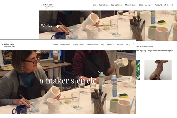
A Maker's Circle: A Maker's Circle is an organization that provides a creative space for the community. The website is designed with an understated background to highlight the craft-work and to create a comfortable, welcoming atmosphere. It is also an ecommerce site that allows users to sign up for workshops and pay through a secure pop-up screen. It has a particularly useful home screen that gives a bit of information about each area of the site, with links to go directly where needed. Mobile-ready.
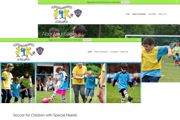
Just4kixs: Just4kixs is an inclusive soccer program designed for children with special needs. The purpose of the website is to get that information out to new families who might be interested and to keep its current members up to date on program activities. The site gives detailed information about Just4kixs and has a user-friendly calendar. Upcoming events are displayed on each page, as well as social media links. The group had an existing logo that emphasizes fun, so the site was designed to complement it. Their wonderful photographs tell the story of Just4kixs best, so they are used extensively thoughout. The site was created in WordPress and is fully responsive.
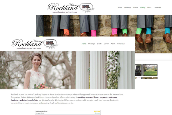
Historic Rockland: Historic Rockland is a wedding and events venue. Images are key for prospective clients to get a feel for the venue and ideas for their own wedding or event. The site has a gallery plus various images throughout. It was written in WordPress to allow the owner to post new images on a regular basis without the need to go through a web developer. Additionally, a logo was designed to reflect the old world charm of the venue. The site is fully responsive.
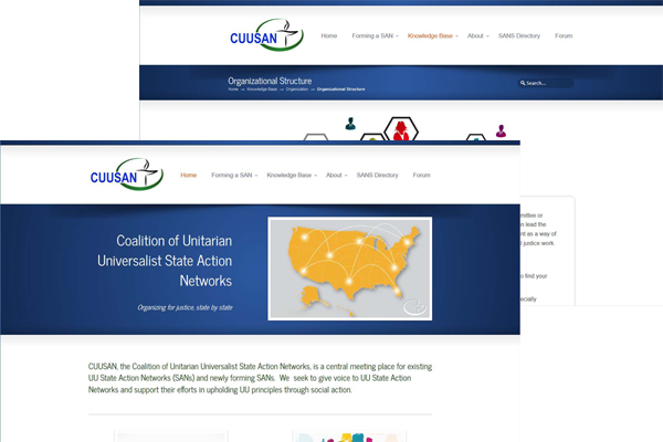
Coalition of Unitarian Universalist State Action Network: This project involved designing a logo and re-designing an older website that was broken. Because its primary purpose is to provide information, the site is very text heavy. To keep it user-friendly, information was broken down into multiple pages for easier referencing. Each page was then given tabs to further divide the sections. In this way, a user can get to the information they need in relatively few clicks. The site was created in WordPress and is fully responsive.
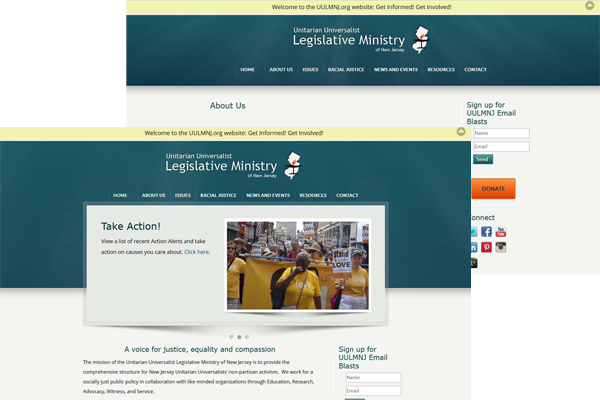
Unitarian Universalist Legislative Ministry of New Jersey: **Note: this site has changed their name, site, and brand and is no longer a link.** The first challenge for this website was creating a logo to handle the exceptionally long business name! The next was developing a style that appealed to two different audiences; volunteers/members and legislators. The site needed to be inviting but formal. The clients wanted the ability to quickly and easily add updates about their various task forces. Because of that, WordPress was chosen as the CMS. The UULMNJ site is fully responsive/mobile-ready.
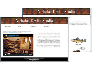
Nicholas Devlin Studio: Nick is an artist specializing in hand-crafted one-of-a-kind fish creations and antiqued signs. He wanted a clean looking site that reflected the rustic feel of his work without making it look like grandpa's attic. The site includes two different portfolio pages, each with its own slideshow feature and an embedded video on the home page. It's written in html and is fully responsive.
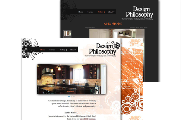
Design Philosophy, interior design: When it comes to a creative interior design firm, pictures tell the story best. There is very little text on this site, but two pages have carousels and there are four additional gallery pages. Rather than use a lightbox-style gallery, this client preferred that the larger photos appear alongside the thumbnails. As a designer, this client has a clear view of her personal style and it was important to reflect that on her website.
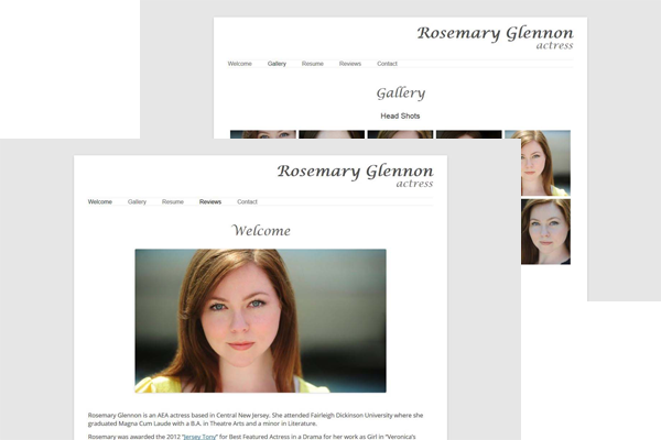
Rosemary Glennon, actress: Rosemary wanted a clean and straight-forward website that was quick and easy to navigate. Casting directors are not going to wait while huge background images load! Because Rosemary would be updating the site with her most current roles and information, we chose WordPress. The site includes a printable pdf resume and a lightbox-style gallery of her portfolio and is fully responsive.
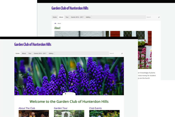
The Garden Club of Hunterdon Hills: This club had an existing WordPress site that was broken and out-of-date, with no one available to fix or update it. I redesigned it to give a light, open and welcoming feel. I also added a calendar page and a photo gallery. The site is text-heavy, so I broke it down into sections with excerpts and "Read more..." areas. GCHH is a fully responsive website.
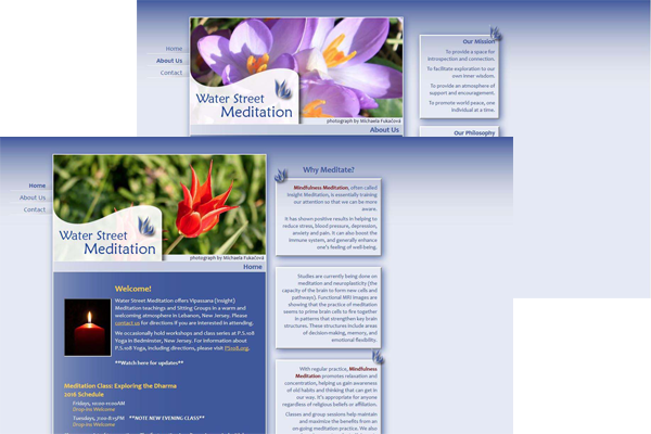
Water Street Meditation: This informal group wanted a simple site to keep members informed of new classes and meetings. They also wanted it to be informative and give viewers an understanding of meditation. To keep it from becoming too text-heavy, I divided paragraphs up into smaller blocks and displayed them down the right side of the page. The style reflects the group's purpose: serenity, peace and beauty.
Content copyright 2014-. ![]() ckg Website Development. All rights reserved.
ckg Website Development. All rights reserved.
Your site should be as individual as you are.